General Assembly
Online Learning Platform
Challenge
General Assembly's learning platform is used by students and enterprise to gain knowledge and skills in UX Design to Data Science. The product was in its MVP phase, and usability issues were negatively impacting customers’ ability to learn. Revenue was being lost due to a poor experience.

Mobile Lesson

Desktop Lesson
Research
We collated historic qualitative feedback from customers. This was prioritized and distributed to employees to raise awareness. Usability fixes were the priority for this project, so new feature requests were planned for later.
Fresh insights were gathered through interviews and surveys with internal teams including Product, Engineering, Design, and Finance. Student users were also given tests and sentiment surveys to collect their additional thoughts on the overall learning experience. Common issues and painpoints emerged quickly:
Heavy animation transitions
UI elements appeared broken
Colors denoted multiple actions & states

Weak hierarchy & use of space
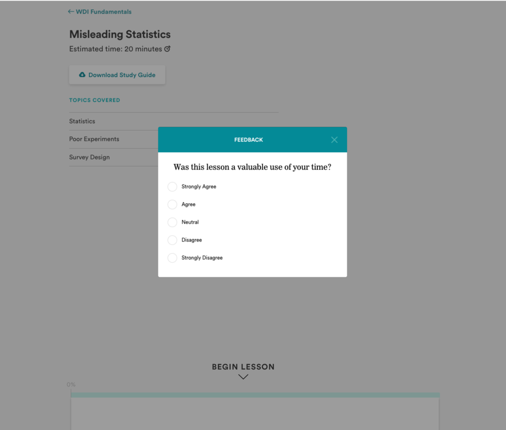
Disruptive feedback collection
Inefficient navigation and orphan pages
Analysis
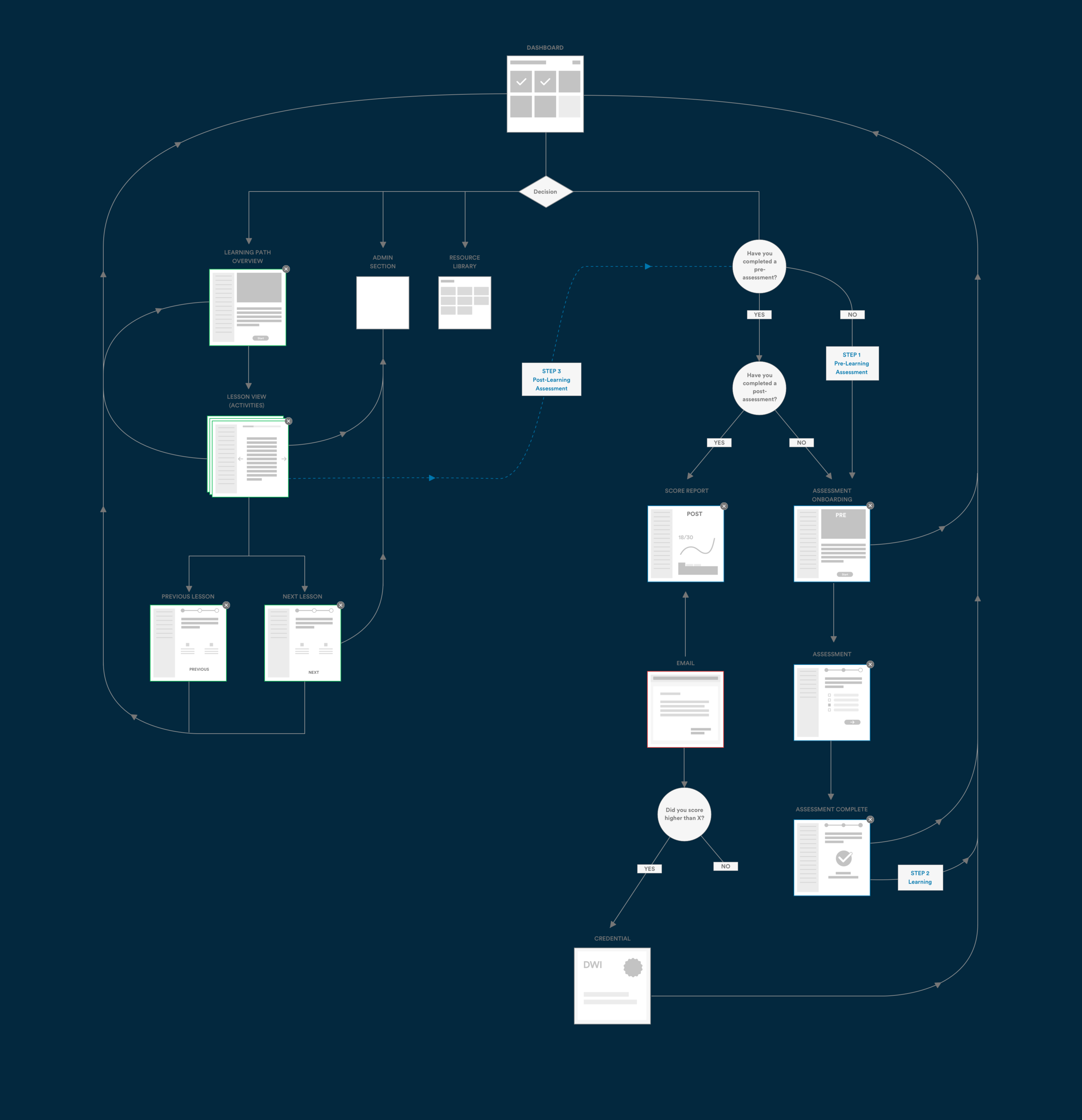
A comprehensive set of sitemaps and userflows mapped out the entire platform for the first time. Platform architecture was examined for ease of use, wayfinding, and UI consistency.

Quantitative datasets were analyzed to find additional issues and insights:
Bounce Rate - Why did users consistently exit some lessons at the beginning?
Sessions - Average times between usage was high. Are users unaware of next steps, uninspired, or just busy?
Scores - Certain quizzes had consistently low performance. Is it the UI, content, or both?
Mobile - Usage was practically non-existent. If we fix the broken layouts, will they come?

Customers
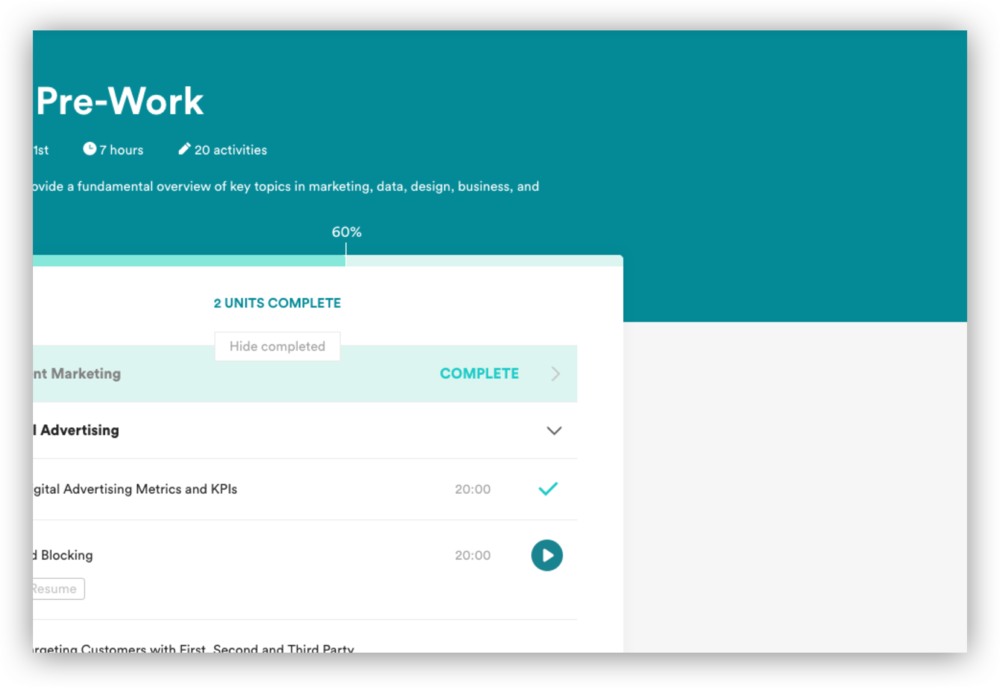
This project addressed usability issues that had plagued the platform since launch. We focused on the “learning path” product which students use for taking bundles of lessons (Color Theory) to complete new skills (UX Design).
We studied who interacts with the platform the most: Students, Instructors, and Learning Architects. We examined their feedback from in-lesson form collection and gathered new opinions via prototypes, surveys, and interviews.

Instructors
More encouragement for students

Students
Better navigation in lessons

Learning Architects
Optimized task flows
Goals
We set high-level goals for the project, taking into account future sprint plans, roadmaps, timing, and other company priorities.
-
Improve Wayfinding
Strengthen hierarchy
Provide clear next steps
-

Less Friction
• Reduce clicks
• Make UI consistent -

Encourage & Motivate
• Show clear progress
• Celebrate moments

KPIs
Time to complete lessons decreases
Completed lessons, paths increase
Retention scores increase
Negative feedback decreases
Time to program lesson decreases
Time to ship features decreases
Enterprise deals increase
Design
GA’s design & development processes were fragmented, inefficient, and unscalable. Multiple design systems were used across features making it difficult to reach consensus. To improve our workflow, we used Abstract for one source of design truth and better collaboration. It reduced re-design churn for modules, and allowed us to hit aggressive deadlines.
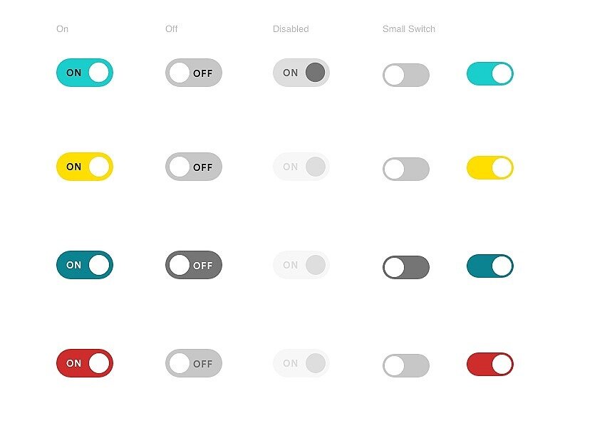
First step was overhauling the old atomic design system - type, shape, color, and space. 12 type styles were reduced to six. Colors went from 30 to 10. Button styles were reduced to a few.
Our small team of four Designers and one Creative Director ran design sprints to pressure test UI combinations. We unified the new atomic system by listing out core functionality vs. future needs. What UI elements could serve multiple products, e.g. the sidebar navigation?
UI Modules

Space

Color

Type
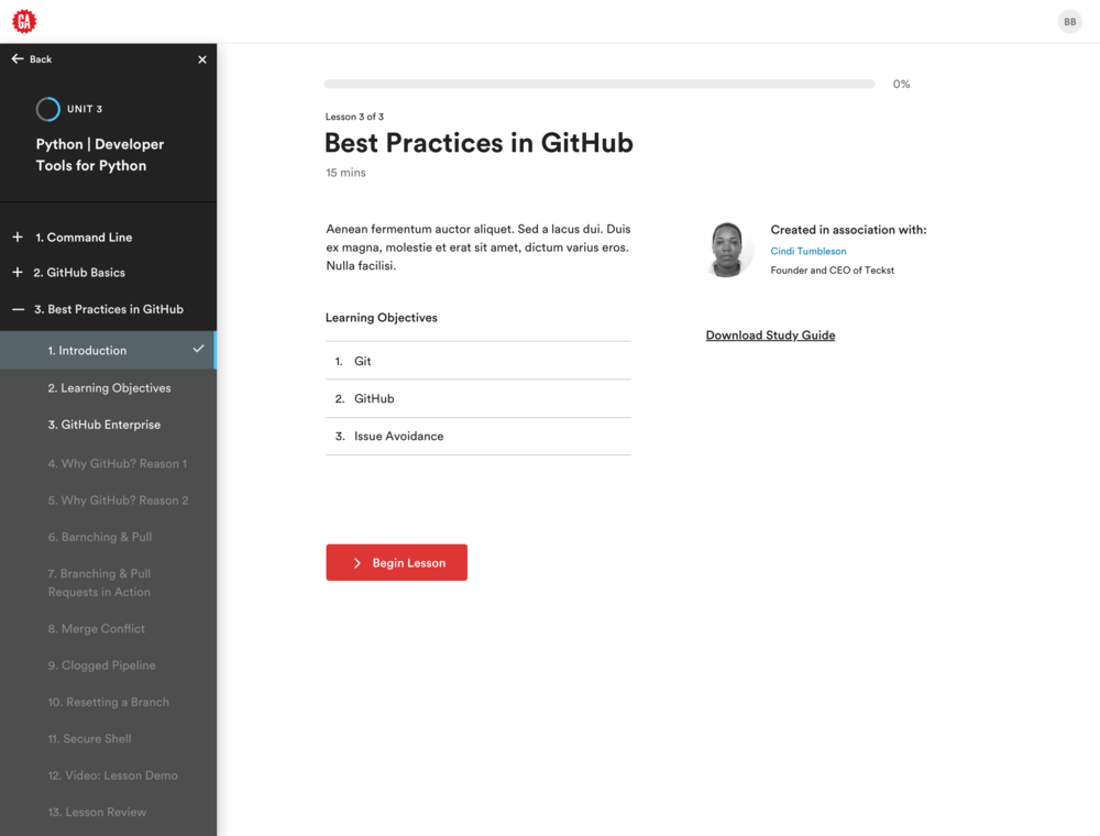
We iterated on many features for the new learning path screens. For example, what patterns can we use for interacting with the sidebar navigation?
Results
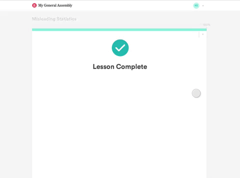
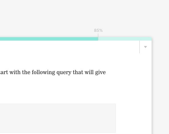
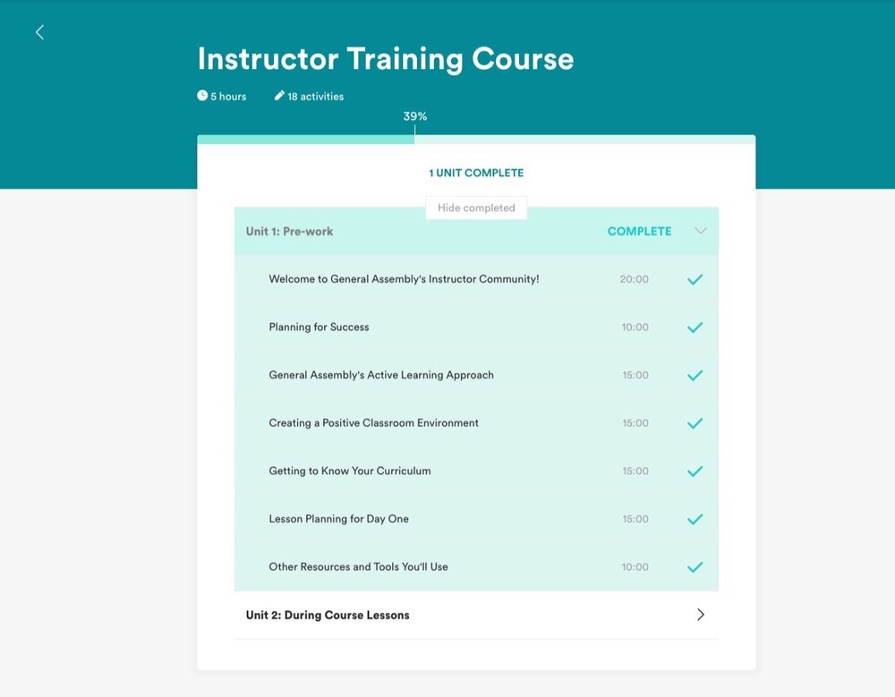
With a fresh UI system, we redesigned lesson screens with the new components. Usability was greatly improved immediately:
A simple line shows clearer progress
Minimal color lessened cognitive load
Red/blue buttons show obvious next steps
Fewer type styles tightened hierarchy
Consistent UI improved wayfinding
Less invasive feedback removed stress
Mobile layouts were made responsive and optimized for space, scrolling, and legi

-
![Red/blue buttons show obvious next steps]()
It all begins with an idea.
-
![]()
It all begins with an idea.
-
![]() Description goes here
Description goes here


Testing
We ran a series of tests with the new features across international campuses. It allowed us to demo new elements, gather initial reactions, and plan enhancements.
A big win was that prototypes now took a fraction of the time to build!


Prototypes
Test 1
Combine the path dashboard views to save steps. Can customers progress more quickly?
Result
Response to the grid view was very positive. It took less clicks and showed more information, without overwhelming.
Test 2
Add a sidebar navigation to lessons. Is the UI clear and concise? What other features would they like?
Result
Customers loved the sidebar which removed the need to visit a separate path page.

Test 3
Change lesson orientation from horizontal to vertical.
Result
Some students loved seeing the full lesson in one scroll. Other students preferred paginated information in the horizontal progression.
“This is great! Let’s me know exactly where I am. I would use it as a project management tool.”
“Scrolling makes it much easier to review a lesson, instead of paging back through the slides.”

Results
Time to build lessons -200%
Time to build prototypes -50%
Student engagement ⬆
Lesson, path completions ⬆
Usability complaints ⬇